Hidden Images in Logos You've Probably Never Noticed
Logos are an integral part of branding and marketing, representing a company's identity and values. While many logos appear straightforward at first glance, some designers incorporate clever and subtl...
Logos are an integral part of branding and marketing, representing a company's identity and values. While many logos appear straightforward at first glance, some designers incorporate clever and subtle elements, hiding hidden images within the design. These hidden images, known as Easter eggs, add depth and intrigue to the logo, often going unnoticed by the casual observer. In today’s article, we will explore five of them.
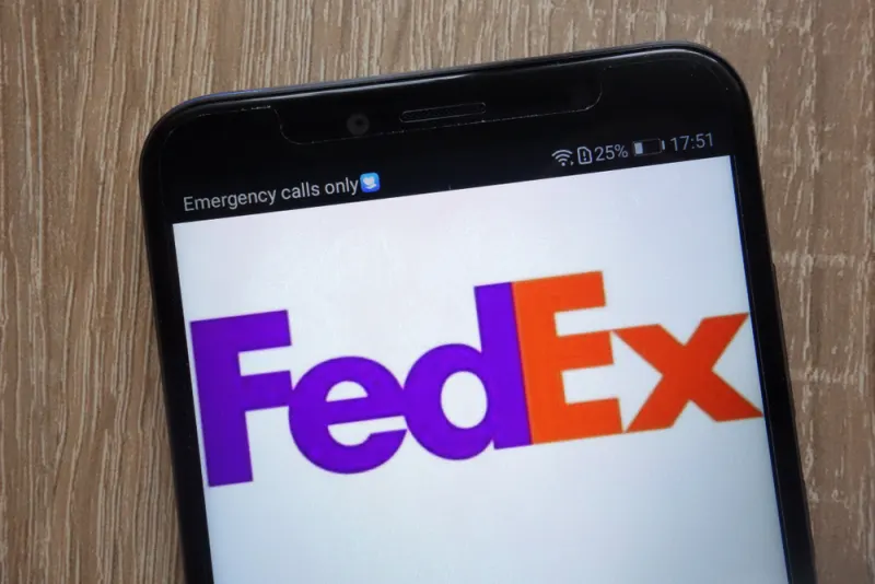
1. FedEx
The FedEx logo, known for its simplicity and strong typography, holds a clever secret that many people miss. Designed by Lindon Leader in 1994, the logo features the brand name "FedEx" in a bold purple and orange color scheme. However, a closer look reveals a hidden arrow formed between the letters "E" and "x." The arrow represents speed, precision, and forward motion, aligning perfectly with FedEx's core values as a global courier delivery service. The intentional inclusion of the arrow showcases the brilliance of the logo's design, capturing the essence of the company's commitment to reliable and efficient delivery services. Once you notice the hidden arrow, you'll never see the FedEx logo the same way again.
2. Toblerone
The Toblerone chocolate brand has a distinctive logo that pays homage to its Swiss roots. Shaped like the iconic Matterhorn mountain in the Swiss Alps, the logo features a mountain peak, but there's more to it than meets the eye. Look closely at the negative space between the mountain's peaks, and you'll notice a hidden image of a bear. The bear is a tribute to Bern, the capital of Switzerland, which is also known as the "City of Bears." The inclusion of the bear in the logo is a subtle nod to Toblerone's Swiss heritage and adds an extra layer of significance to the design.
3. Amazon
The Amazon logo is recognized worldwide for its representation of an arrow that points from the letter "A" to the letter "Z." This simple yet clever design subtly conveys that Amazon offers everything its customers need, from A to Z. However, the hidden image in the Amazon logo goes even further. If you look closely at the arrow, you'll notice that it forms a smile, connecting the letters "A" and "Z." The smile represents the company's commitment to customer satisfaction and a positive shopping experience.
4. Baskin-Robbins
Baskin-Robbins, the well-known ice cream chain, is famous for its vast array of flavors. Unsurprisingly, their logo also holds a hidden surprise. The pink "B" and brown "R" in the logo are cleverly designed to create the number "31" in the negative space between the letters. The number "31" symbolizes Baskin-Robbins' claim of offering 31 flavors of ice cream, one for each day of the month. This subtle inclusion in the logo reinforces the brand's unique selling point and gives customers a delightful surprise when they discover the hidden numerical element. Baskin-Robbins' logo is a playful and creative example of how companies can incorporate their core offerings into their branding.
5. Tour de France
The logo of the world-renowned cycling race, Tour de France, may seem like a simple design at first glance. However, a closer inspection reveals a hidden cyclist within the letter "R" of the word "Tour." The cyclist appears to be riding along the race route, with the wheel of the bike forming the letter "O" and the handlebars extending from the "U." This hidden image reflects the essence of the Tour de France as an iconic cycling event, capturing the excitement and athleticism of the sport.