Famous Logos With Hidden Meanings
Logos, those tiny symbols that become the face of a brand, are like visual signatures. They're meant to be easily recognizable, but what if I told you that some of these logos have secret messages tuc...
Logos, those tiny symbols that become the face of a brand, are like visual signatures. They're meant to be easily recognizable, but what if I told you that some of these logos have secret messages tucked away in plain sight? That's right! From tech giants to ice cream shops, the world of logos is brimming with hidden meanings waiting to be discovered. Let's take a stroll through the iconic symbols of renowned brands and unveil the stories behind their seemingly simple designs.
1. Apple
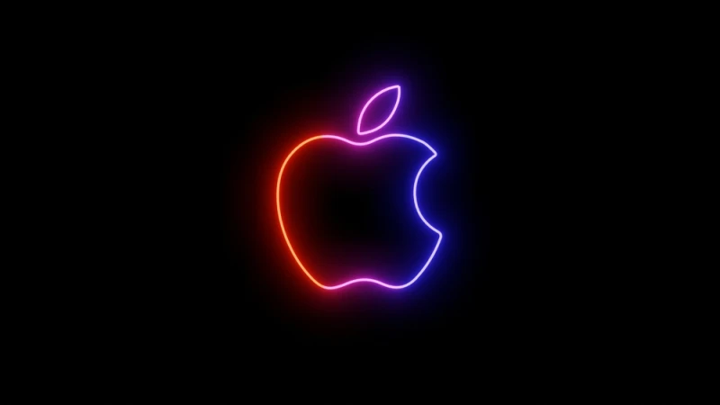
Ah, the iconic half-munched apple that graces the gadgets of millions. Beyond its sleek simplicity, the Apple logo harbors a subtle nod to the world of technology. The missing chunk on the right side of the apple isn't just a design choice—it's a clever play on words. It's a byte, a unit of digital information. This ingenious twist not only reflects Apple's innovative prowess but also encapsulates the essence of the tech giant's game-changing products. Moreover, that bite isn’t just a quirk; it's a deliberate imperfection. It speaks volumes about the philosophy of Apple, a reminder that in the pursuit of innovation, perfection isn't the destination but an ongoing journey.
2. FedEx
Have you ever noticed the hidden arrow in the FedEx logo? No? Well, it's time to take a second look. The negative space between the letters 'E' and 'X' forms a sleek, forward-pointing arrow. This seemingly subtle design element isn’t just a visual flourish; it's a clever representation of FedEx's commitment to precision and forward momentum. The arrow symbolizes speed, accuracy, and efficiency—qualities paramount in the world of global shipping and logistics. The brilliance lies in the subtlety; it's not shouting for attention but rewards the observant eye. That hidden arrow transforms the FedEx logo from a mere corporate symbol to a visual representation of the company's core values.
3. Amazon
The Amazon logo, with its cheeky smile, is more than a friendly welcome to online shopping. Look closer, and you'll notice the arrow that starts at 'A' and curves all the way to 'Z.' It’s not just a quirky design choice; it’s a subtle representation of Amazon's extensive product range, spanning everything from A to Z. But there's more—it also forms a smile, signifying the delightful customer experience the e-commerce giant aims to deliver. This hidden gem in the logo is a clever encapsulation of Amazon's commitment to being a one-stop-shop for all your needs.
4. Toyota
Toyota's logo might seem like a straightforward arrangement of ovals forming the letter 'T,' but there's more depth to it than meets the eye. The intersecting ovals aren’t just a design choice; they symbolize the interconnectedness of the hearts of Toyota's customers and the heart of its products. The three ellipses represent the unity of the customer, the product, and progress, weaving together tradition and innovation. But there's an additional layer of symbolism—the spaces between the ovals subtly form a 'cross,' emphasizing the mutual trust between Toyota and its customers. It's a brilliant fusion of design and philosophy, showcasing how a logo can go beyond aesthetics and become a visual representation of a brand's core values.
5. Baskin-Robbins
Baskin-Robbins, the ice cream haven, has a logo that's more than just a vibrant display of scoops. Look at the 'BR,' and you'll notice the pink parts cleverly forming the number '31.' It's not a random choice—it represents Baskin-Robbins' claim to fame, offering 31 flavors, one for each day of the month. This hidden touch adds a layer of playfulness to the logo, emphasizing the diverse and extensive flavor options available. The use of pink for the number isn't just a color choice; it draws attention without overpowering the overall visual appeal. This clever incorporation of the number '31' transforms the logo from a mere representation of ice cream to a visual celebration of Baskin-Robbins' commitment to providing a myriad of choices.